White on white: making dark mode a token decision, and the palette that failed its own contrast test
- #react
- #tailwind
- #daisyui
- #design-tokens
- #dark-mode
- #accessibility
- #wcag
- #i18n
- #tdd
- #building-in-public
I’m building Turmarium in public: a multi-tenant B2B SaaS for schools. A school signs up as a tenant, registers its people (admins, staff, teachers, students) and its academic structure, and runs a real term on it. It’s English-first because I build in the open, with Brazilian Portuguese as a first-class locale because that’s who I want to sell it to.
Four updates went into the parts you can’t retrofit. Update 1 proved tenant isolation at the database with Postgres row-level security. Update 2 switched it on for real traffic and built the first browser screens. Update 3 built the academic catalog behind a strict import boundary. Update 4 added offerings and enrollments and fired the first domain event.
All four shipped a front end that worked and looked like scaffolding: functional React screens, one hardcoded indigo, and a dark mode that was half-wired, where some components read a theme variable and some carried a raw color. Update 4 ended pointing at two feature epics, scheduling and grading. Before either, I stopped and spent one web-led sprint turning the scaffold into an actual design system, so those epics build their tables and their gradebook on a mature system instead of re-styling a scaffold twice.
Two things I did not see coming: the palette I chose failed its own accessibility math, and I threw out the styling engine the plan had already locked.
The bug that named the sprint
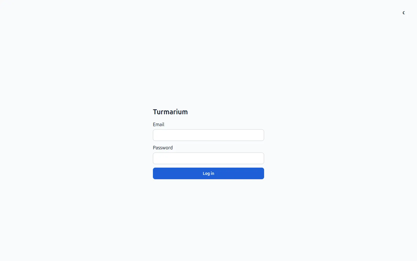
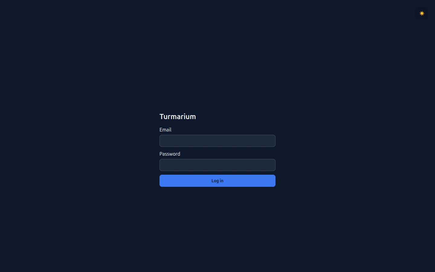
Open the app in dark mode and the login screen was white text on a white card. Unreadable, a flat WCAG 1.4.3 failure on the first screen every user sees. It passed every unit test, because a green Vitest run says nothing about whether two colors can be read against each other. That’s the same lesson update 2 learned in a browser, one layer up.
The wrong fix is to paint the login card. White-on-white on one screen is what a half-wired dark mode looks like from the first place it happens to show. The right fix is to make dark mode a property of the system, so no single screen gets to be light while the rest goes dark.
Dark mode is a token problem, not a CSS problem
The pattern is design tokens, in three layers: primitive to semantic to component. Primitives are the raw ramps (slate-900, an azure ramp) that components never touch. Semantic tokens are named by role (surface, ink, line, accent), and each one carries a light value and a dark value. Components read the semantic names only, never a hex.
The whole trick is that a semantic name resolves to a different value per theme, so flipping one attribute on <html> re-colors everything at once:
@plugin "daisyui/theme" { name: "turmarium-light";
  --sem-surface-base: #f8fafc;  --sem-text-primary: #0f172a;  /* ... */ }
@plugin "daisyui/theme" { name: "turmarium-dark";
  --sem-surface-base: #0f172a;  --sem-text-primary: #f1f5f9;  /* ... */ }
A component asks for bg-surface text-ink and gets the right pair automatically. Dark mode goes from a bug scattered across every component to one place you configure. Get the three layers right and it’s config; get them wrong, as I had, and it’s a defect hiding in whichever component someone forgot, invisible until they open the app at night. The theme toggle then is almost nothing: a pre-paint script in index.html sets data-theme from the stored choice (or the OS default) before React mounts, so there’s no flash of the wrong theme.
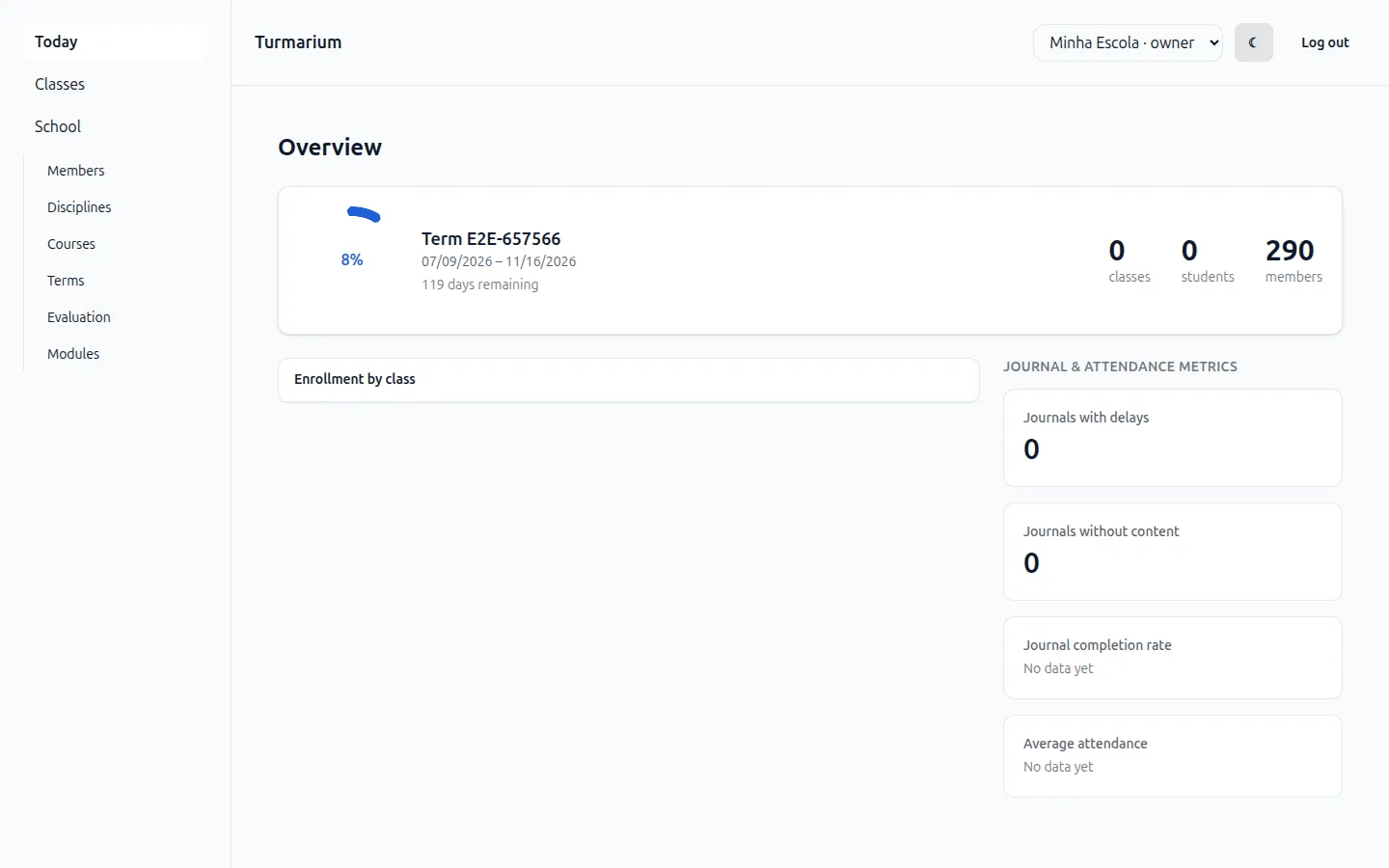
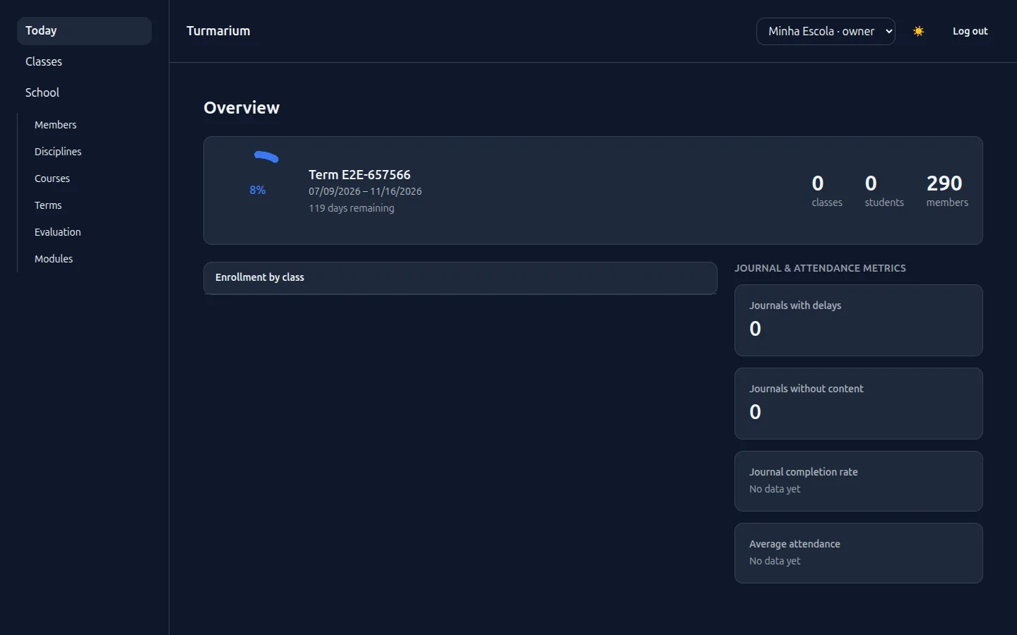
Same screen, same components, one data-theme flip: every surface and ink swaps together, which is the whole payoff of routing colors through semantic tokens instead of per-component hexes.
The sprint plan had a Locked decisions table, and one row picked shadcn/ui as the styling engine. Then the mandatory brainstorming gate re-opened it. Looking at it with fresh eyes and the actual Tailwind-v4 docs open, daisyUI was the better fit for this app: Tailwind-v4-native, themes expressed as data-theme plus CSS-variable tokens, no JavaScript color objects to parse. So the “locked” decision got unlocked and changed.
That’s the point of the gate. A locked decision is a default with reasons, not a sacred cow. The gate exists precisely to re-open one when the evidence in the room has moved, and the honest move is to write the override into a decisions doc rather than let it live only in my head. One consequence I took on with eyes open: daisyUI isn’t Radix-grade for accessibility, so the modal is a native <dialog> with showModal(), which gives a real focus-trap, a top-layer scrim, and browser-managed Escape for free, and closes the keyboard-trap finding. That’s what I’d have wanted anyway.
The palette that failed its own contrast test
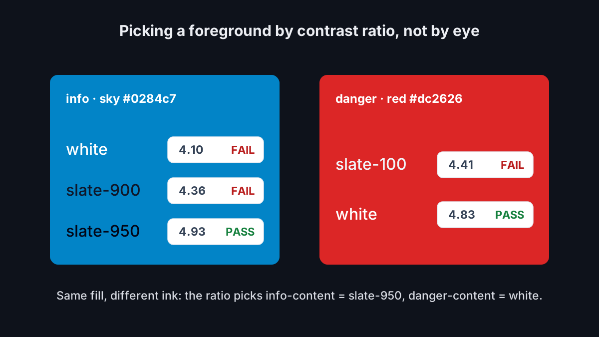
I picked Azure Institutional, and then the arithmetic argued back. Status “info” is sky (#0284c7). WCAG AA wants a contrast ratio of at least 4.5:1 for text, and my first two guesses for the foreground on that sky fill both failed: white came in at about 4.10:1, near-black slate-900 at about 4.36:1. The color that clears it is slate-950 (#020617), at about 4.93:1. In dark mode the error text (#f1f5f9 on the danger red, red-600 #dc2626) landed at about 4.41:1 and also failed; pure white clears it at about 4.83:1.
None of those were taste calls. The formula chose the foregrounds, and I wrote the ratios into the token file as comments so the next person (probably me) doesn’t quietly “simplify” a passing color back to a failing one:
--color-status-info: #0284c7;         /* sky, distinct from the azure accent */
--color-status-info-content: #020617; /* white & slate-900 both fail 4.5:1 on sky-600
                                         (4.10 / 4.36); slate-950 clears it (4.93) */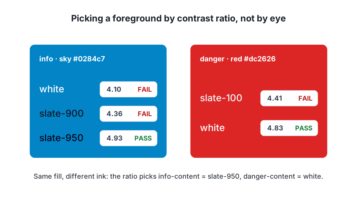
That comment is the same reflex as update 1’s CI note about running the isolation suite as an unprivileged role: a guarantee that’s invisible in the diff needs its reason written down where someone would otherwise undo it.
The seam I shipped and the pipeline I didn’t
Turmarium sells to schools, and schools will want their own color. So the azure ramp is not hardcoded; every step reads through a per-tenant seam:
/* a future [data-tenant] block overrides one var and the whole UI re-hues, no refactor */
--color-accentramp-600: var(--t-accent-600, #1f5fd6);
The pipeline behind it is deferred on purpose: a per-org seed, a generated OKLCH ramp, sanitizing a tenant-supplied color before it ever reaches the DOM, and picking a contrast-safe foreground for whatever they choose. Tenant color flowing into CSS is both an injection surface and a contrast risk, and I’m not shipping that half-proven. The variable is real and pinned by a token test; the machine behind it arrives when it’s a sprint’s actual job.
The rest of the sprint was the unglamorous half of a design system, and it’s real: Intl dates rendering dd/mm/yyyy for pt-BR, an errors namespace mapping backend codes to localized messages announced through an aria-live region, a CI key-parity check so en and pt-br can’t drift apart, a reusable empty/loading/error pattern wired to TanStack Query’s isPending/isError, and an admin dashboard reading a real tenant-scoped overview endpoint. A caveat: the new status tables are styled on mock data for now, design-forward ahead of their real wiring, so I don’t restyle them twice.
What I learned
Accessible contrast is arithmetic, not taste. My Azure palette failed its own WCAG math on the first status color I checked, and the formula, not my eye, picked the foregrounds. Writing the ratios next to the colors is part of the fix.
The other lesson was procedural. The plan had “locked” shadcn as the styling engine, and reopening that lock at the brainstorm gate turned out to be the right call: with the real Tailwind-v4 docs open, daisyUI was plainly the better fit. A locked decision stays a default I can argue with, and the honest move when I win the argument is to write the override down rather than let it live only in my head.
Where it landed: 144 web tests green (up from 80 last update) at 92.76% statement and 86.24% branch coverage, and 130 backend tests green at 97%, both above their gates. import-linter still reports two contracts kept and zero broken. Both themes are verified in a real browser, axe is clean on the screens I touched, and the screen that named the sprint reads in both:
What’s next
Now the system is mature, the two epics update 4 teased build on it instead of re-scaffolding. Scheduling turns an offering into a calendar (meeting patterns, and the sessions they generate); grading turns it into an outcome (evaluation schemes, assessments, a final grade). The gradebook grid (frozen axes, inline edit, live averages) is the real stress test of these tokens, and the first screen I’ll let reach for a heavier grid library on top of them.
So the question I’ll leave with, for anyone who has retrofitted dark mode onto an app that shipped without it. Did you find a real shortcut, or is a token-layer refactor the only honest fix? Every quick patch I tried just moved the white-on-white bug to a different screen. I’d like to hear what actually worked.
I'm building this in the open, one update at a time.
Keep reading
- Matrícula by reference: one enrollment number, one home, and the rule a CHECK constraint couldn't holdUpdate 6 of the Turmarium build log. Turmarium is a multi-tenant B2B school-management SaaS, English-first with pt-BR first-class. Update 6 builds the curso: a Course, its matriz curricular (disciplines attached to periods, level-guarded), and student registration that assigns a matrícula (the enrollment number a Brazilian student carries). The número lives on exactly one row (CourseEnrollment), the old Membership.enrollment_number is dropped, and every turma enrollment reads the matrícula through a foreign key instead of copying it. The sequence looks like a calendar and isn't: it's continuous per org, allocated under a locked Organization row so concurrent registrations can't collide. The cross-level guard (a discipline may only sit in a course of its own level) can't be a single-row CHECK constraint because it compares two tables, so it lives in the service with a red-first reject test and a UI that never offers the wrong choice. Discipline.level migrates from free-text to a shared enum through a pure-function backfill map that carries its own unit test. academic fires its second domain event, CourseEnrollmentCreated, still with no subscriber. 162 backend tests green at 95.22% coverage, 163 web tests green at 89.09%, import-linter two contracts kept and zero broken.July 29, 2026
- Shouting into an empty room: offerings, enrollments, and the first domain event I shipped with no subscriberUpdate 4 of the Turmarium build log. Turmarium is a multi-tenant B2B school-management SaaS, English-first with pt-BR first-class. Updates 1-3 proved tenant isolation at the database, switched it on for real traffic, and built the academic catalog behind a strict import boundary. Update 4 makes the architecture finally do something: offerings (turmas, a discipline taught in a term to a section) and enrollments, two more tenant-scoped tables with forced RLS, plus the first domain event, EnrollmentCreated, emitted onto the event bus that has sat unused since update 1. The honest twist: the event fires into an empty room. No module subscribes yet (that is a later epic); only a test listens. Which is lucky, because writing this update is how I discovered the emitter does not do what I designed it to do: it fires inside the still-open request transaction, not after commit, and the in-process test that covers it cannot see the difference. PROTECT keeps a class you actually ran from being deleted by accident, limit_choices_to turns out to guard the form and not the API, and update 3's half-built syllabus revisit gets paid off first. 124 backend tests, 80 web tests, import-linter at two contracts kept and zero broken, coverage near 97% on the API and above the gate on the browser app.July 17, 2026
- Good fences: the academic catalog, and the import boundary that broke once a module used itUpdate 3 of the Turmarium build log. Turmarium is a multi-tenant B2B school-management SaaS, English-first with pt-BR first-class. Updates 1 and 2 proved and then switched on tenant isolation with Postgres row-level security. Update 3 builds the first real feature on top of it: the academic catalog (disciplines, syllabi with ordered units, terms with one current at a time), each a new tenant-scoped table with forced RLS, a django-ninja CRUD API, and browser screens driven off the generated OpenAPI client. It is also the first module to live behind the import boundary from update 1, and the boundary broke the moment the module imported anything real. The fix is a one-word import-linter flag, plus a probe test to prove the contract still catches a real violation. Along the way, a route that shadowed itself into a 405, and a syllabus you can create but can't navigate back to, both shipped honestly. 95 backend tests, 62 web tests, import-linter at two contracts kept and zero broken, coverage above the gate on both sides.July 10, 2026
Get the next update by email
Build-in-public updates and new posts, delivered as a digest. Double opt-in · no spam · unsubscribe anytime · handled by Buttondown.