Turning on the lights: a demo-driven redesign of the RegWatch dashboard
- #design-systems
- #ui-design
- #svelte
- #tailwind
- #dashboard
- #redesign
- #css
- #building-in-public
- #govtech
Diário Oficial da União (DOU) is Brazil’s official federal gazette: the daily record where laws, fines, appointments, grants and public tenders get published. RegWatch is the product I’m building in public, a “Google Alerts for the DOU” that watches the gazette on behalf of a firm’s clients and emails a short, categorized digest of every hit.
Update #6 gave the API a browser: a Svelte dashboard where a firm logs in and triages its gazette hits. I ended that update with a confession. The dashboard was deliberately plain, and making it look good was the next update, along with “the honest question of when ‘make it look good’ is worth the time versus when it’s procrastination with a color picker.”
This is that update. I redesigned the whole dashboard, and I want to be straight about why, because the answer is the interesting part, not the hex codes.
Plain was a choice, and then it was a problem
The first version was intentionally restrained: a light canvas, a blue accent, system-ish type, cards with thin borders. In design terms that’s a modern-minimal look, and it was the right call while I was still getting the flows right. Restraint is honest when the product is young. It also kept me from fiddling with shadows when I should have been fixing the CSRF handshake.
Here’s what it looked like:
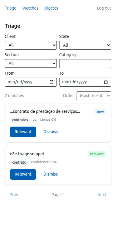
It works. It is also forgettable, and forgettable became a problem the moment the dashboard stopped being just my build target and started being the thing I show people. A screenshot in a build-log post, a link a recruiter opens, a five-minute walkthrough for someone who might pilot it: those are all first impressions, and a first impression of an instrument that watches a firehose of legal text for you should feel like an instrument, not a settings page. The flows were right. The register was wrong.
That’s the decision, stated plainly: I judged the plain look to be costing me at the exact surface where RegWatch gets seen, so a redesign was worth doing. Not because minimal is bad, but because this product, at this moment, needed to read as something you’d want to be caught using.
What “atmospheric” meant in practice
I keep a locked design system for the dashboard in a design.md the whole app builds against, and the redesign was a genre change inside it: from modern-minimal to what the system calls atmospheric. The chosen theme is a cool-violet near-black canvas with a molten-brass accent that emits light, an Instrument Serif display face, Geist for UI text, and JetBrains Mono in uppercase for the small labels. The reasoning wasn’t “dark mode looks cool.” It was that RegWatch’s actual job is to watch for a signal in a stream of noise, and an instrument-after-dark register carries that metaphor in a way a white enterprise layout doesn’t.
It also wasn’t a one-knob change. The two themes differ on every axis the system tracks: lightness (near-black paper versus a white canvas), type voice (a lowercase classical serif versus a grotesk sans), and accent temperature (a warm brass around 50° versus a cool electric blue). Writing it down that way is the point of keeping a design system at all. “Make it look better” is a vibe and a bottomless one; “swap these three axes and re-derive the tokens” is a task with an end. The old plan is still legible underneath, which is why nothing below the surface had to move: same screens, same information architecture, a different skin stretched over them.
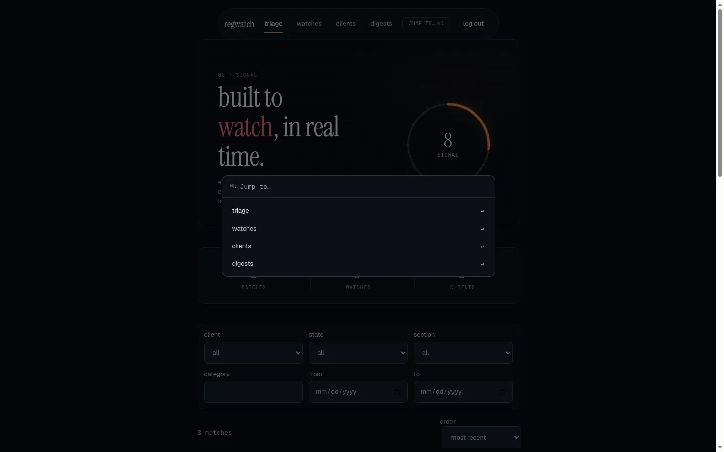
The one signature move is literal about it. The triage hero carries a hand-built signal dial, a radial meter, instead of a generic glowing orb:

The dial and the stat row next to it are the part I care most about, and not for the glow. Their numbers, matches, watches, clients, are read from the real counts the app already has. The design system’s own rule for that hero is that the apparatus is fed by real data or it shows nothing: it must never invent a number to look busier. The login page is the same principle in the negative. It carries no stat row at all, because there is no authenticated data before you sign in, and a made-up figure on a login screen would be a small lie. So the login became a different shape entirely, a two-pane “split studio” that states the brand on the left and asks for one action on the right:
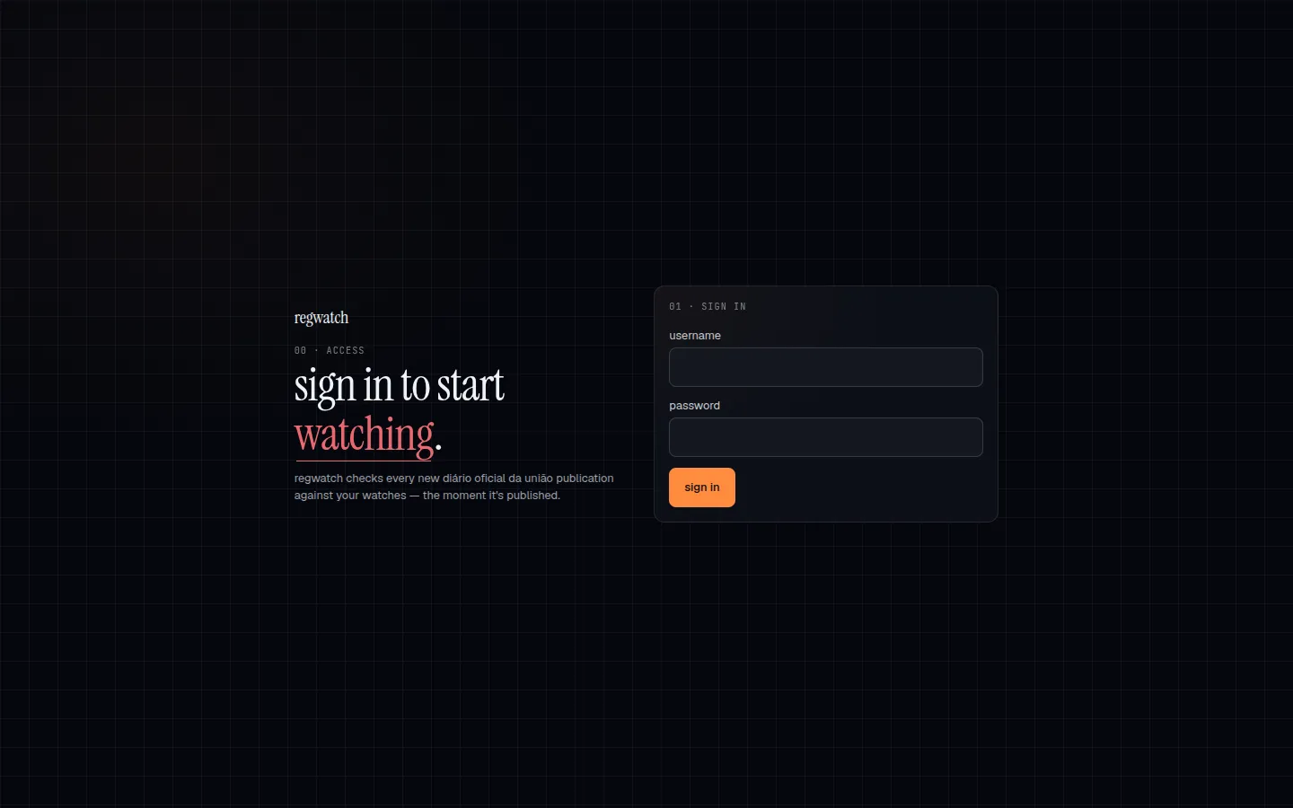
My never-fabricate rule for the writing turns out to be the same rule the design system enforces on the pixels. That was a nice thing to notice: the honesty constraint I hold for these posts is not a separate value from how the product presents itself. A dashboard that fakes a chart to look impressive is doing the thing I refuse to do in prose.
One thing in this update isn’t a restyle at all: a Cmd/Ctrl+K command palette to jump between screens, new here, riding in with the floating-pill nav it hangs off. It only routes to screens that already existed, so nothing underneath moved, but it’s the one change that alters what you can do rather than how things look.
How I kept it from being a rabbit hole
The reason “make it pretty” so often is procrastination is that it has no natural end. You can always nudge a shadow. What made this bounded was that the design system decides the look once, and every screen just reads it. I did not restyle four pages by hand and eyeball them against each other. I changed the genre and the tokens in one place, and the pages, which share components, routes, and data with the plain version, took the new skin. Nothing about the API, the auth, the routing, or the triage logic from the last two updates changed. The redesign touched the paint and not the plumbing, which is exactly why it was safe to do in a focused pass instead of an open-ended one.
I should be honest about my own hands here, because it matters for how you read the result. I did not hand-author every CSS rule. I direct a design system: I set the genre, argue for the signal-dial metaphor over a generic orb, write the rule that the hero shows real numbers or none, and decide the login is a different macrostructure from the app pages. The system emits the pixels from those decisions. The skill on display is the direction and the constraints, not artisanal CSS, and pretending otherwise would be its own small fabrication.
The unglamorous half rode along in the same commit, because a redesign is a natural time to pay off small debts. I moved the web workspace from npm to pnpm, which dragged Node from 20 to 22 (pnpm 11 needs it) through the Dockerfile and the deploy workflow. And I closed a latent .dockerignore gap that would have let a local node_modules leak into the image build. Neither is exciting. Both are the kind of thing you fix while you’re already in there.
What I learned
A redesign is worth it when the plain version is costing you at a surface where the product gets seen, and it’s procrastination when it isn’t. That sounds obvious written down, but the honest test is whether you can name the surface. I could: the demo, the screenshot, the recruiter’s first click. If I couldn’t have named one, the right answer would have been to leave it plain and go build the next real thing.
And the guardrail against the rabbit hole is a design system, not discipline. Willpower doesn’t stop you nudging a shadow at midnight; a locked file that every page reads, and that you change in one place, does. The bound came from the tooling, not from me being strong about it.
What’s next
With this, the build log has caught up to where RegWatch actually is. The clean-room core, the ingestor, the unattended daily run, the deploy, the secured API, the dashboard, and now its redesign are all shipped and public. The next update won’t come from a pre-drawn roadmap; it’ll come from what putting this in front of a real firm surfaces, which is the only feedback that has ever told me the truth about what to build next.
A question I’m genuinely split on, and would take input on: for a solo builder, where’s the line between directing a design system and hand-crafting the UI? I lean on the system because it makes “make it good” boundable, but I wonder what I’m not learning by not sweating the pixels myself. If you’ve worked both ways, I want to hear which one made you better. The code, and the design system, are public: follow the RegWatch series.
I'm building this in the open, one update at a time.
Keep reading
- From curl to click: a same-origin Svelte dashboard for RegWatchUpdate 6 of the RegWatch build log: the secured API from #5 was curl-only, so I gave it a browser. A Svelte 5 dashboard that logs in over the same session, served same-origin from the same Django service via WhiteNoise so the cookie-and-CSRF security model just holds, no CORS. The decision behind that, the browser side of the CSRF handshake, and a frontend built test-first.July 24, 2026
- White on white: making dark mode a token decision, and the palette that failed its own contrast testUpdate 5 of the Turmarium build log. Turmarium is a multi-tenant B2B school-management SaaS, English-first with pt-BR first-class. Updates 1-4 proved tenant isolation, switched it on, built the academic catalog behind an import boundary, and fired the first domain event. Update 5 is the detour before the big feature epics: one web-led sprint that turns the working-but-unstyled scaffold into a real design system. Dark mode becomes a three-layer token decision (primitive to semantic to component); the styling engine the plan had locked (shadcn) gets swapped for daisyUI at the mandatory brainstorm; the chosen Azure palette fails its own WCAG contrast math; and the per-tenant accent ships as a seam with the pipeline deferred on purpose. 144 web tests, 130 backend tests, coverage 92.76% on the browser app and 97% on the API, import-linter still two contracts kept and zero broken.July 21, 2026
- A wall between tenants: RegWatch grows a secured DRF APIUpdate 5 of the RegWatch build log: the daily pipeline had a database full of matches nobody could reach, so I gave it an HTTP surface. Session auth, invite-only access, and a single workspace-scoping chokepoint that makes one firm's data 404 for another. Plus the secure-by-default reflex that crashed the batch jobs, and why one image now has to boot two ways.July 20, 2026
Get the next update by email
Build-in-public updates and new posts, delivered as a digest. Double opt-in · no spam · unsubscribe anytime · handled by Buttondown.