Rendering my own blog diagrams as code: brand-themed TikZ with LuaLaTeX
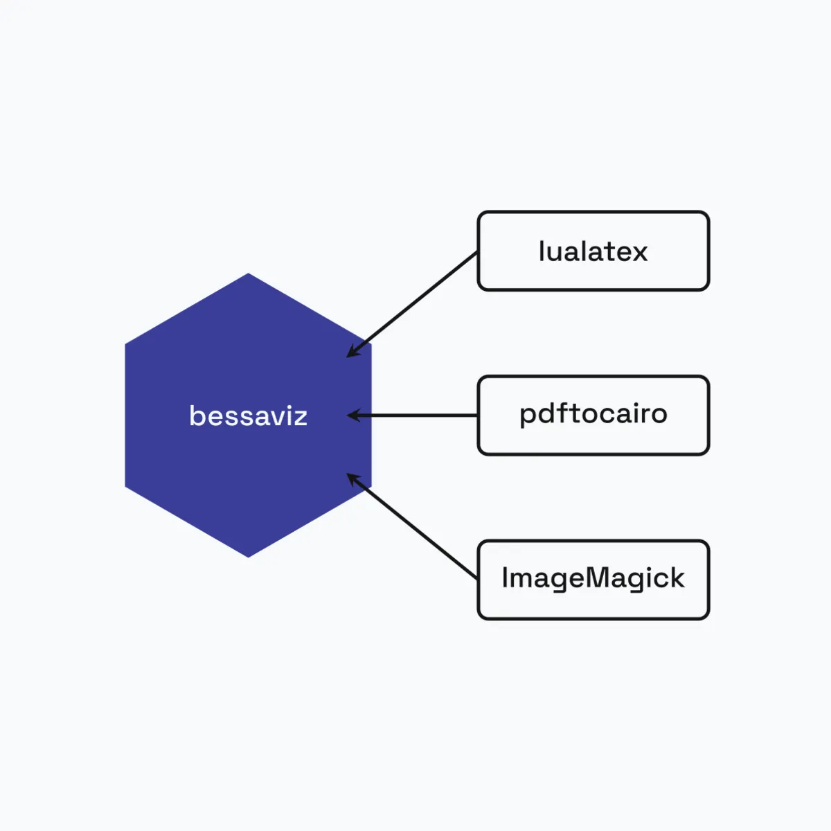
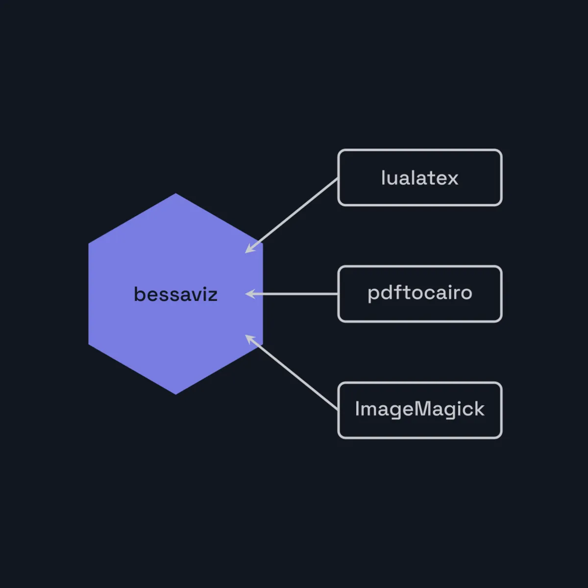
The figure below was produced by four lines of Python. It is also a picture of the thing that produced it.
from bessaviz.adapters.raster import export_both
from bessaviz.diagrams import hexagon_ports

export_both(lambda: hexagon_ports("bessaviz", ["lualatex", "pdftocairo", "ImageMagick"]).build(),
            out_dir, "ports")
That’s the whole invocation. It writes ports.light.png and ports.dark.png, both 1200 by 1200, both on the exact background color this page is painted with, in about two seconds. I committed them next to the post, and the site swaps between them when you flip the theme toggle.
I want to explain why a personal blog has a LaTeX toolchain in it, because it is not the obvious choice and I did not arrive at it by pure reasoning.
The thing I was actually trying to avoid
I write a lot of posts about architecture. Ports and adapters, a boundary, a pipeline, two lanes doing the same job differently. Those arguments want a picture, and for a while I didn’t make them, because making one meant opening a drawing tool, placing boxes by hand, exporting a PNG, and then being unable to change it three weeks later without repeating the whole ritual. A hand-drawn diagram is a dead end: no diff, no review, no regeneration when the palette moves.
Diagrams-as-code is the standard answer. The diagram’s source is text, the text lives in the repo, and a build step turns it into an image. Mermaid is the popular version of this and I use it here too. What Mermaid could not do was look like my site.
That mattered more than it sounds. This site already generates its social-preview cards at build time from a parameterized template rather than designing 1200×630 images by hand, and once you have done that once, a diagram whose colors are approximately-your-blue reads as borrowed. A figure sitting inside a bordered card on a dark page, drawn in a stock palette on a white rectangle, announces that it came from somewhere else.
So I forked a TikZ generator called tikz_gen into bessaviz and gave it three things the original didn’t have: my palette as named tokens, high-level composers for the shapes I keep drawing, and a one-call export to a square canvas in both themes.
The palette is the only interesting design decision
Everything else in this library is plumbing. This part is the reason it exists.
The theme layer holds seven tokens, each with a light and a dark hex, mirroring web/src/styles/global.css on the site: primary, accent, ink, warn, error, base, muted. Before compiling, it emits one \definecolor per token for the active theme:
--- LIGHT ---                          --- DARK ---
\definecolor{primary}{HTML}{3A3D98}    \definecolor{primary}{HTML}{787DE0}
\definecolor{ink}{HTML}{151516}        \definecolor{ink}{HTML}{C9CACE}
\definecolor{base}{HTML}{F7FAFC}       \definecolor{base}{HTML}{121621}
\definecolor{muted}{HTML}{727D95}      \definecolor{muted}{HTML}{444C63}
Diagram code never writes a hex. It says token=PRIMARY or token=MUTED, and the theme decides what that means at compile time. That single indirection is what makes “dark mode for free” true rather than aspirational: the same composer call, run twice with a different theme, produces two figures that are each correct on their own background. No second source file, no palette fork to keep in sync.
The legibility is computed rather than eyeballed. An audit walks every token against the canvas it will sit on and measures the WCAG contrast ratio:
primary  light identity   8.71 / 3.0   ok
ink      light text      17.41 / 4.5   ok
warn     light status     2.03 / 3.0   MISS
primary  dark  identity   5.00 / 3.0   ok
ink      dark  text      11.03 / 4.5   ok
warn misses on the light theme, at 2.03 against a 3.0 floor, and that miss is deliberately non-blocking. Identity hues and text are hard requirements because a reader has to distinguish and read them; warn and error are status colors that never appear without a label next to them, so color is not carrying the meaning alone. The test suite fails CI on a blocking failure and ignores this one. Encoding which misses matter is the part that took thought. Running the check was easy.
Ports and adapters, because the toolchain is not mine
The figure at the top is an honest picture of the layering, and the arrow direction is the point. Each box names an external program, and the arrow standing for it is the adapter that wraps it: LualatexCompiler around lualatex, the raster adapter around pdftocairo and ImageMagick.
bessaviz is organized the way I organize Django apps: a domain layer that knows about figures, nodes, arrows and colors and nothing else; an application layer of builders and abstract ports; and adapters that talk to the outside world. The ports are three small abstract base classes, FigureRenderer, FigureExporter and LaTeXCompiler, and each names a capability rather than a program. LualatexCompiler implements the compiler port. TikZRenderer implements the renderer port. PngExporter composes them.
Ports and Adapters, also called Hexagonal Architecture, is the name for that shape, and the reason the arrows in the hexagon point inward is Dependency Inversion: the adapter depends on the abstraction the core defines, never the reverse. Nothing in the domain layer imports subprocess. In practice, on a 4,800-line library, that buys one concrete thing worth naming: ImageMagick 7 ships a magick binary where 6 shipped convert, and resolving which one exists is one line inside the raster adapter that no diagram code can see.
The render path itself is four steps and worth stating plainly, because “TikZ” makes people expect something heavier:
- A composer returns a builder;
.build()yields thetikzpicturesource. - The theme layer wraps it in a standalone document with the color definitions and a fontspec block that loads the site’s own fonts, Space Grotesk and Plus Jakarta Sans and JetBrains Mono, bundled as TTFs converted from the
.woff2files the site already serves. lualatexcompiles it to PDF. LuaLaTeX specifically, because fontspec needs it and I wanted the real brand fonts instead of Computer Modern.pdftocairorasterizes at 300 dpi with a transparent background, then ImageMagick scales and pads it onto a square canvas filled with the theme’sbasecolor.
The transparency step in there is not incidental. Rasterizing onto a white background and then compositing leaves a visible seam at the crop edge; rasterizing transparent and flattening onto the base color once gives a single uniform fill, which is what lets the figure sit inside its bordered card without a halo.
Three runs on my laptop: 0.92s, 0.92s, 1.43s per figure per theme. Two seconds for a light/dark pair is well inside the loop where I’ll actually iterate on a diagram instead of settling for the first version.
What it costs
Two constraints, both learned by rendering something and looking at it rather than by reading the code.
Labels pass straight through to TeX, so a brace, underscore, caret, percent or dollar sign in a box label breaks the compile. And the composers use fixed box widths and neither wrap nor shrink text, so an over-long label overflows its box and collides with the incoming arrowhead. The measured budgets are written down in the scripts that call the composers: about 10 characters at the two-lane composer’s box width, 11 at the cycle, 13 at the pipeline chain, 12 at the hexagon. Short labels turn out to be right regardless, since these render at a couple of hundred pixels on the blog index, but discovering the limit by seeing text run through an arrow is a poor way to learn it.
I hit the other limit while making this post. The canvas is square, because the library was originally built to render a batch of LinkedIn images, and a square is what LinkedIn wants. A five-step horizontal chain on a square canvas letterboxes into a thin ribbon with two-thirds of the image empty. I rendered exactly that, looked at it, and deleted it. The pipeline composer already snakes into a serpentine grid by default for this reason and I had overridden it, which is the kind of mistake you only make about your own tool.
Three pipelines, on purpose
The honest state of this site is that it has three ways of making a figure, and I have not consolidated them.
Charts come from matplotlib and ship as SVG, over a shared _style.py. That’s what the pass-rate chart in how browser fingerprinting catches your scraper is, and what every cost and score plot in the cheaper model that cost more is: numbers I measured, drawn to scale. Notably, that pipeline solves the theme problem the opposite way from bessaviz. It saves one file with a fully transparent background and draws every axis, tick and label in a single mid-contrast neutral that reads on both a near-white and a near-black page, and it separates series by linestyle and marker as well as by color, so the chart survives greyscale and colorblind readers.
Flowcharts come from Mermaid sources under scripts/diagrams/, rendered to PNG by a local step. Deliberately local: Mermaid needs a DOM, so rendering at build time would put a headless Chromium into a deploy pipeline that currently has zero browser dependency.
And schematic, on-brand shapes come from bessaviz, the only one of the three that knows what my site looks like. The thumbnail on how I use a code knowledge graph over MCP is a two-lane figure from the same library, contrasting the fourteen files a grep loop opened against the four a single query returned.
Two files for a diagram, one transparent file for a chart. Both are correct, for different reasons: a diagram is mostly filled shapes and needs the surface underneath to be a known color, while a line chart is thin strokes on nothing and can afford to be neutral. Picking one strategy for both would have cost something real in one of them, which is the same story one level up. A chart wants a plotting library, a flowchart wants a graph layout engine, and a branded schematic wants a typesetter that can load my fonts and my palette.
What all three share is the rule that actually matters: the source is text, it lives in the repo next to the post, and the image is regenerable from it. I rendered two candidate figures for this post, looked at both, and deleted the one that letterboxed. That cost a two-line edit and about four seconds.
If you build in public and your diagrams still live in a drawing tool, that’s the change worth making first. Text source, committed output, one command to rebuild. Whether the renderer is Mermaid or matplotlib or a LaTeX compiler is a detail you can pick per figure, and picking three is allowed.
References and further reading
- TikZ and PGF manual: the drawing language everything above compiles down to
- fontspec: loading system/bundled OpenType fonts, and why the compiler has to be LuaLaTeX or XeLaTeX
- Hexagonal Architecture: Alistair Cockburn’s original write-up of ports and adapters
- WCAG 2.2 contrast minimums: the 4.5:1 text and 3:1 non-text thresholds the palette audit checks against
- Mermaid: the text-to-diagram tool handling the flowcharts on this site
I'm building this in the open, one update at a time.
Keep reading
- The cheaper model that cost 51% more: what my eval harness caughtGPT-5.6-terra lists 20% below GPT-5.4 on both input and output. I swapped my expense tracker's default to it on that basis, then measured it against real receipts: it cost 51% more per receipt, and it would have returned HTTP 400 on every single photo.August 17, 2026
- Typed domain exceptions with stable error codes: the kernel raises a code, the adapter writes the proseAn accounting kernel that must never say a word to a user. Every domain failure gets a typed exception and a stable machine code; one adapter table turns that code into localized prose. Here's the hierarchy, the import cycle it caused, the contract check that reported green through a hole, and the bug I found writing this.August 11, 2026
- Don't let the LLM do the math: deterministic discount proration for receipt OCRA vision model reads the receipt fine, then quietly loses a cent splitting the discount. Here's why I moved the arithmetic out of the model into a small Python function whose shares always sum to the amount paid.August 7, 2026
Get the next update by email
Build-in-public updates and new posts, delivered as a digest. Double opt-in · no spam · unsubscribe anytime · handled by Buttondown.